
A perspective piece from The Listening Market
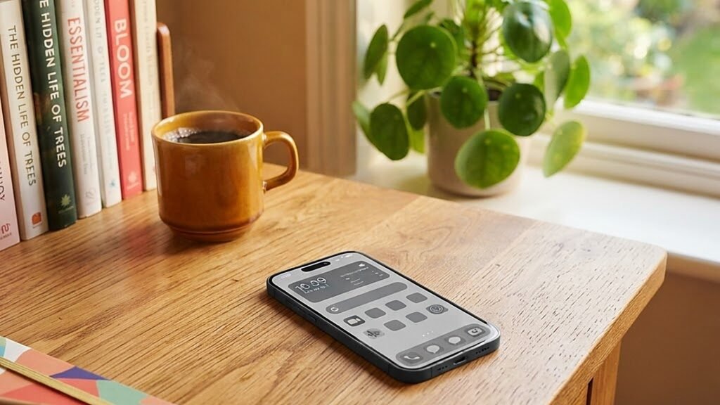
The setting is unremarkable: a takeaway coffee, a train platform, four idle minutes. What is remarkable is the screen. Where a phone would once bloom into colour, all icons summoning their careful gradients, this one shows a flat grey field. The photo reel has become a contact sheet. The taxi app has become a grey rectangle with a grey dot inching along a grey map. It is, by any aesthetic measure, uglier. And that, precisely, is the point. A quiet experiment that began with a handful of productivity obsessives has migrated into the mainstream, and by 2026 turning a phone to greyscale has become one of the most popular pieces of screen-time advice that people actually follow. The interesting question is why dulling a screen matte grey works so well on a brain that spent a decade being trained to love colour.
The machine that learned to scream in colour
To understand why grey works, it helps to understand what colour was doing there in the first place. Colour in an interface is rarely decoration. A red badge is urgency. A golden ring around a friend’s story is a loop begging to be closed. A notification’s blue is the exact shade engineered to say come back, somebody thought of you. Over fifteen years, the apps on a phone were refined into a chorus of carefully tuned invitations, and the science behind them was never accidental. Brightness and saturation signal reward in the brain’s oldest currency. A colourful phone is not a neutral tool; it is a vending machine that flags a treat.
Greyscale removes the flag while leaving the machine running. The app is still there. The messages still exist. Nothing has been blocked, deleted or restricted, which matters psychologically, since willpower tends to collapse the moment it feels like a cage. What changes is the pause before the tap, the half-second in which a grey rectangle fails to promise anything. For many people, that half-second is the whole difference between intending to check something and drifting into forty minutes of ambient scrolling. A grey phone simply stops shouting. And in the quiet, a lot of people discover they had no real reason to pick it up.
From productivity hack to mainstream habit
For years, greyscale lived in the same drawer as cold showers and four-in-the-morning alarm clocks: tricks discussed earnestly in forums and tried by the kind of person who tracks everything. The migration into ordinary life has been swift and largely unremarked. Phone settings now include scheduled greyscale modes that activate in the evening, or only inside certain apps, or at the press of a shortcut that turns a phone grey until the next morning. Digital wellbeing guides recommend it without embarrassment. Parents set it on teenagers’ phones as a negotiated compromise. Some workplaces quietly enable it on staff devices used for single tasks, on the observation that a grey screen makes a checking device stop moonlighting as an entertainment device.
What made the habit spread, more than any single feature, is that it is reversible in a way most digital discipline is not. Deleting an app is a commitment. A dumbphone is a lifestyle. A grey screen is a setting, and everyone who tries it knows the escape hatch is one toggle away. Paradoxically, that easy exit is what keeps people in. Because greyscale never triggers the feeling of deprivation that scuttles most screen-time resolutions, it survives the week, and a technique that survives a week is a technique that gets recommended to a friend.
The aesthetic objection, and why it keeps losing
The most common rebuttal is also the most reasonable: a grey phone ruins photography, maps, anything genuinely visual. A sunset reduced to grey is a sunset wasted. The objection is fair, and it explains why greyscale has evolved from a permanent vow into a scheduled guest. The version of the habit that spread in 2026 is mostly conditional. Greyscale after dark. Greyscale on weekdays. Greayscale on every app except the camera, the maps and the one game a person has consciously chosen to keep. Phone operating systems met the demand halfway, letting people carve out exceptions rather than submit to a total rule.
But even in its partial forms, the philosophy underneath travel further than the setting itself. Once a person has seen how strongly colour was pulling them, they cannot entirely unsee it. Users report a lingering suspicion toward their own home screen, a new awareness that certain icons were placed where they are because someone studied exactly where thumbs rest. Some respond by reorganising their phones entirely, pulling everything off the first screen except the dull essentials. Greyscale snowballs into a broader audit, and the audit is really about one question: which parts of this device serve the person holding it, and which parts serve someone else.
An old idea that finally found its public
Greyscale is not new, which makes its sudden popularity more interesting, not less. Phone makers have shipped a monochrome option for well over a decade, installed quietly in accessibility menus, where it served people with colour vision differences and a small number of users who discovered it made long reading sessions easier. E-readers built entire beloved product lines on the principle that ink beats light. The industrial uses were always practical: pilots, photographers and night-shift workers have long relied on red or monochrome displays because colour in low light is a distraction dressed as information. None of these communities ever imagined the setting becoming lifestyle advice. The idea sat in the settings, patient as a folded umbrella, waiting for a culture to become exhausted enough to reach for it.
That culture arrived on schedule. The mid-2020s brought a broad reassessment of screens and their entitlements, from dumbphone revivals to phone-free schools to the quiet pride people now take in owning a device that is boring on purpose. Greyscale slots neatly into that family of corrections because it requires nothing to be renounced, only muted. It borrows authority from the accessibility world too: what began as a tool for making devices usable by more people is being reused as a tool for making them bearable to everyone. The journey from misc accessibility setting to mainstream digital wellbeing advice is quietly hopeful, a reminder that the most durable fixes are usually already installed, unglamorous in a menu, waiting to be taken seriously.
What it does to time
The results people report are consistent enough to have become a genre of their own. The phone loses its gravitational pull at the edges of the day. Sleep comes more easily to those who switch to grey in the evening, partly because a grey screen is simply less compelling to lie awake with. Boredom, briefly, returns, and with it a strange surplus of small moments, the second half of the train ride noticed, a room looked at rather than through. Few people claim the change is dramatic, and that too is part of the story. Greyscale is not a detox or a reset. It is a small tax on the least valuable habit of the century, applied at the point of impulse.
Behavioural researchers describe the effect as friction aligned with intention rather than restriction. A person who wants to scroll still can. The grey just makes the scrolling slightly less rewarding, which is often enough to interrupt a loop that was running on autopilot. The modern attention problem was never solved by heroic willpower at the moment of temptation, because temptation arrives a hundred times a day. It moves an inch at a time, in settings chosen once and forgotten, and grey dulls every temptation at once.
A commentary disguised as a colour scheme
There is a broader reading of the greyscale trend, and it is not really about phones. Turn a screen grey and the phone stops performing. It becomes what it was before the arms race of colour made it a slot machine, a tool that waits to be used. The people adopting greyscale are not opting out of modern life; they are renegotiating one term of the deal, the one that says every spare second belongs by default to whatever is brightest. In a sense, the grey screen is a return to the earliest promise of the device: a rectangle that does things for you when you ask, and sits quietly, colourless and off duty, when you do not.
The moment, like the colour schemes it rejects, will probably pass into something settled. But the underlying instinct is durable: after a decade of brighter, faster, louder, people are discovering the value of dull on purpose. A grey phone is less fun to look at. That is exactly the argument for it.